
Shop Previous RSD Releases
Shop limited edition Records Store Day releases! Limit 1 per title per person.
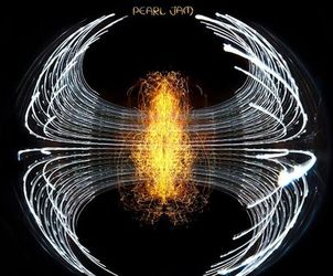
Pearl Jam Out Now
Pearl Jam’s 12th studio album Dark Matter is out now on CD and vinyl.

Record Store Day Vinyl Lovers Contest
Win a Victrola T1 Turntable System, 10 LPs, Selektor record bags + a $100 Amoeba gift certificate!


What's New
View All


Live at Amoeba
View All

deadmau5 Signing
April 25th 12pm - Hollywood
Loren Kramar
May 1st 5pm - Hollywood
San Fermin
May 4th 3pm - San Francisco
Jessica Pratt
May 8th 5pm - Hollywood
Music We Like
Great Deals on Handpicked Titles!


What's In My Bag?
View All
Indie Exclusives

Check out our Indie Exclusive section on Amoeba.com! It's chock full of vinyl and CDs only available to independent record stores. You'll find limited edition colored vinyl, signed CDs, and alternative artwork. Oh, the joys of being independent.
Amoeba Podcast
Every Thursday on EarWax, two longtime record store clerks share the stories behind the albums we love. Hilary and Cody also chat about new releases and in-store events, so you can stay up to date with Amoeba.
Gift Certificates

Give the music or movie lover in your life a gift certificate for our stores or an online gift code.